Choosing Colours
One of the hardest parts of painting can be something as simple as choosing a colour. There are so many things to take into account from the size of the home or space to the decor in the room or scenery around the house. The colours you choose are expressions of yourself and it is sometimes hard to find a colour that reflects that. Here are a few tips to help make choosing colours a bit easier.
- What types of colours do you like? The first step is identifying colours you like, looking around your house can help. Do you have a favorite area rug, picture, or maybe even a flower? Don’t be afraid of being bold. There is always a way to merge punches of colour without going over board. You can add them as a front door, accents, decor or accent walls.
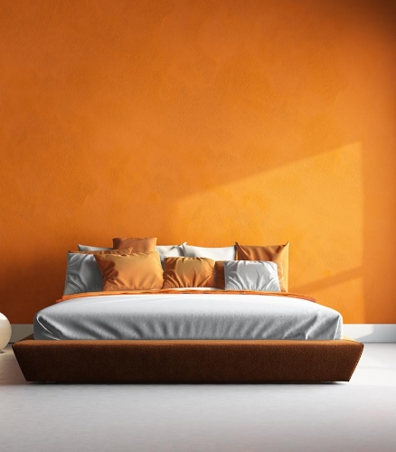
- What are you painting? Once you have decided on the colours you like it’s time to think about the space you are painting. The darker a colour the smaller it makes things, the lighter the bigger. If you have a small rancher it would be better to stay on the lighter side. Where as a large multi-level house would be able to handle a darker colour. When choosing colour for interior spaces it is always good to go with lighter colours in spaces like bathrooms and hallways. The only time I would recommend a dark colour in a smaller space would be in a bedroom as this is a place of rest. Other things to take into account are the lighting, items in the space and how many windows. A lot of large trees around your house can make it feel closed in if you choose a dark colour, the darker the space the lighter the colour should be. Yellow lights warm up your colours and White light Cools them down.
At this point you should have a vague idea of what you are looking for. The colours that interest you as well as the general shade you want to stay in.
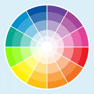
3. Choose your colour scheme. There a few different choices of colour schemes, by choosing a colour scheme you are helping to make sure colours that flow together. I have added a basic colour wheel to help.
a. Complimentary Colour scheme
A complementary colour scheme is colours chosen from opposite sides of the colour wheel. For example, blue and orange or purple or yellow. When choosing this type of scheme make sure you very the shades and saturation levels. If they are at the same level they start to compete with each other.
b. Split Complimentary colour scheme
A split complimentary colour scheme is colours chosen from one colour and then two others together but opposite of the colour wheel from the first. For example, yellow, blue-violet and red-violet or red, blue-green and yellow-green.
These two colour schemes are some of the most complicated and while they can make a space stand out if not chosen with care they will overwhelm.
c. Triad Colour Scheme
A Triad colour scheme is colours chosen from three equal points on the colour wheel. For example, red, yellow and blue or orange, purple and green. This is great when choosing colours for multiple rooms and still wanting to create colours that go well together.
d. Monochromatic Colours Scheme
A Monochromatic colour scheme is when you use colours from the same family. For example, dark green, medium green, light green. This is the most common use of colours on homes and creates a nice harmony without a lot of effort.
e. Analogous Colour Scheme
An Analogous colour scheme is when you use colours next to each other on the colour wheel. For Example, red, red-orange or red-yellow. While quite similar to a monochromatic colour scheme this one adds just a little more pizzazz.
Once you have a general idea it’s time to play around with the colours chosen, here are a few quick tips to make it easier.
- Use no more than three colours in each room.
- The darker the colour the smaller the space will feel.
- Don’t be afraid of colour.
- Adding soft colours to your walls gives you the option to change the feel of a room by changing the decor and not the paint.


